
Wednesday, July 29, 2015

Monday, July 6, 2015
Eucalyptus Warm 5x7 oil painting new
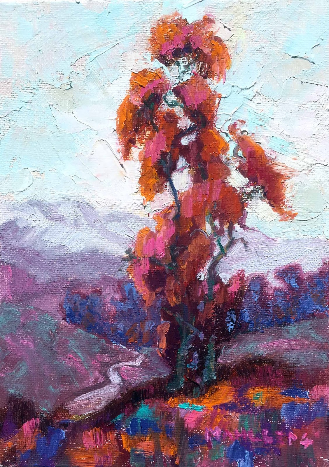
Eucalyptus Warm
Continuing with the same palette however adding orange. I wanted to push the warmth of this palette and found that orange would be required to get the effect I was aiming for. After all, the Palette is more like a guideline, right?
Thursday, July 2, 2015
I lost My Color Sense!
Some people have told me that I am “good” with color. This is true of my years as an interior designer, as well as a painter. But I lost it!
I expect that after 5 years of technical training without emphasis on color might have been the reason. I know so much more about the technical aspects of painting; possibly my color knowledge has not caught up.
I admire #StephenQuiller for his color use in his paintings. I purchased his book, “Color Choices, Making Sense Out of Color Theory”, and decided to do the exercises he outlays in his book.
He has teaches a basic palette to more complicated color palettes, such as, Monochromatic, Analogous, Complementary, Triadic. A palette is the paint color’s you choose for a painting and the fewer paint colors the more simple the color choices are when painting.
Monochromatic Color Scheme Orange------


Palette: Orange, White
Blue or Black to neutralize Decisions are
Lighter/Darker
Brighter/ Greyed
Warm/Cool
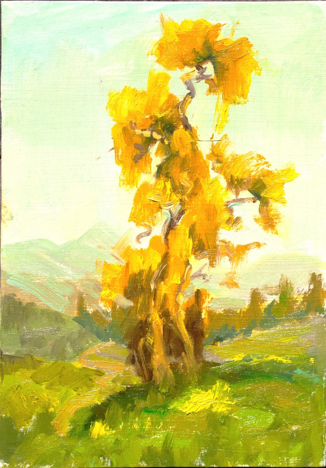
--Analogous Scheme
Palette: Yellow, Yellow Green, Green, and White
(With Red to neutralize and provide contrast)
Follow along with me as I show you a few samples of the same image, using different color schemes.
As I practiced these limited palettes, I found I prefer a full range of values (white to black) and the play of temperatures (warm to cool).
As I practiced these limited palettes, I found I prefer a full range of values (white to black) and the play of temperatures (warm to cool).
Because the above painting did not have enough temperature variation, I chose a similar Analogous palette that was shifted toward blue.

! ! ! !

! ! ! !
Green Blue Green Yellow Green Permanenet Rose
The labels are under the pure out-of-the-tube string of colors. The varieties of colors you see
are mixtures of two of the tube colors together (basically the midway point of
two colors), such as the yellow green mixed with the Permanent Rose creates the
tan in the chart.
Below are three paintings and all have been created from this palette.
 |
| Eucalyptus Queen |
 |
| Eucalyptus Teal |
 |
| Eucalyptus Periwinkle |
| Eucalyptus Blue Green painting below is available at Daily Paintworks |

Eucalyptus Blue Green (Teal) revised 7/6/15
I will be exploring this palette a little longer and will post some more. Leave a comment and let me know what you think. Thanks :-)
Subscribe to:
Posts (Atom)